The project itself :
Project Overview
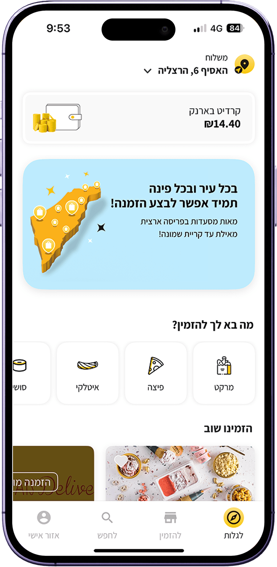
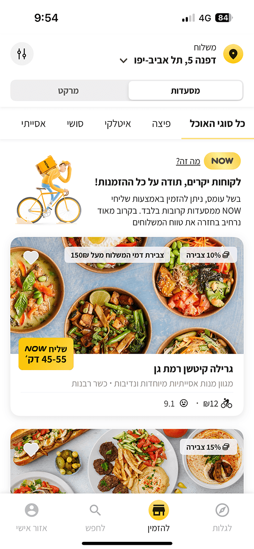
Our food delivery app is a popular platform that allows customers to easily order food from their favorite local restaurants. The app is designed to make the ordering process fast, convenient, and reliable, while helping users browse menus, customize meals, and track their deliveries with ease.
Problem:
Mishloha’s cart abandonment rate was 25%, significantly impacting revenue and customer retention. Feedback revealed critical pain points:
Key performance indicators:
To measure the project’s success, we tracked several key metrics throughout the process. Order completion rate helped us understand whether the redesigned experience reduced cart abandonment and supported revenue growth. Checkout time reflected the efficiency of the ordering process, with shorter times indicating a smoother and more seamless flow. Cart interaction rate allowed us to monitor actions such as editing, customization, and duplication, helping us understand how users responded to the new features.
A confusing ordering process lacking a logical flow
The disorganized checkout process causes important details to be overlooked, leading to confusion and disrupting the purchasing flow

Editing or removing items in the cart is unintuitive
When users edit an item on the checkout page, they are redirected to the restaurant page, breaking the flow. Additionally, the inability to add the same dish with different toppings restricts customization in the cart

What We Learned:
User Research
We analyzed the checkout experiences of prominent competitors to identify best practices:
Competitors
Wolt:
Streamlined two-step process (order summary and payment/shipping details)
Glovo:
Clear subheadings and a logical hierarchy enhance navigation
DoorDash:
Bottom sheets enable users to edit items without leaving the checkout page.
Takeaways for Mishloha
Mishloha offers a wider variety of payment options, requiring a compact yet clear design to prevent overwhelming users. Leveraging insights from competitors, we aimed to simplify the user journey while addressing our unique requirements
Designing the Solution
Starting the Design
Our food delivery app is a popular platform that allows customers to easily order food from their favorite local restaurants. The app is designed to make the ordering process fast, convenient, and reliable, while helping users browse menus, customize meals, and track their deliveries with ease.
Solution:
Based on these insights, we established design goals for the new cart section focused on creating a clear and organized ordering process:
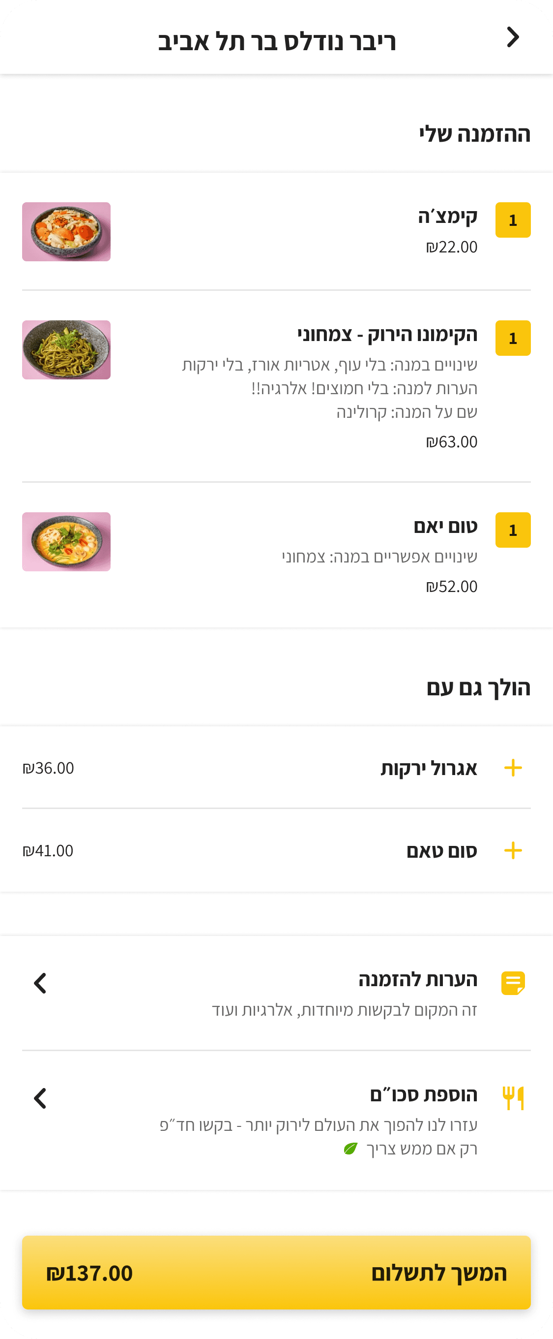
I restructured the flow into two distinct steps, separating order details from payment and shipping information for greater clarity
The headings provide clear divisions on the page, making navigation effortless for users
Adding a quantity number next to each dish
Increased white space creates a cleaner, more inviting design, resulting in a less cluttered and more pleasant experience
Users can now edit the dish in a bottom sheet, staying on the same page and allowing them to continue their flow without interruption
Now, users can add another dish by opening a bottom sheet with clear, reset options for easy customization


The project schematically :
Outcome
Our food delivery app is a popular platform that allows customers to easily order food from their favorite local restaurants. The app is designed to make the ordering process fast, convenient, and reliable, while helping users browse menus, customize meals, and track their deliveries with ease.
Takeways:
The redesigned cart and checkout experience significantly improved key metrics within three months of launch
Order Completion Rate: Increased by 30%, translating to higher revenue
Checkout Time: Reduced by 40%, leading to a more efficient user experience
User Satisfaction: Post-launch surveys indicated a 25% improvement in customer satisfaction scores
User Feedback:
The feedback we received highlighted a noticeable improvement in usability, with users describing the new experience as faster, simpler, and more intuitive.
“The checkout feels so much easier and faster now!”
“I love being able to edit my order without losing progress.”